Content
GWT project contains three content pages.
Snapshot – displays financial details like Balance Sheet (BS), Profit and Loss A/c (PL), Quarterly data (Qtr), Cash Flow (CF) and Holding details of a Symbol with forward or backward navigation capability to view other periods. It has collapsible graphs of Price, Price to Earnings (PE) and Price to Book (PB) movements. For each category a Pop up displays data for the entire period.
Manage Watchlist – create and manage multiple Watch Lists which is a list of symbols.
Watchlist – displays financial details of symbols for a watch list in a Data Grid
Tutorial covers Snapshot in detail, and other two pages are similar in design, and one may go through them once they are comfortable with Snapshot.
6.1. Snapshot
Snapshot displays various data of a Symbol, and it uses following custom widgets.
AutoSuggest – search and select a Symbol.
FactPanel – displays some financial indicators in row.
ChartPanel – collapsible graphs of Price, PE and PB ratios.
FactTable – displays data of a category in a two column table.
FactGrid – displays data of category for all periods in a tabular table.
ToolbarItem – controls to navigate the data.
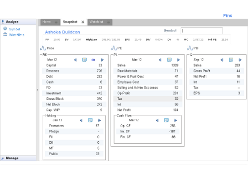
Figure 6.1. Snapshot
Snapshot is a complex UI, and we are going design and add these widget one by one so that readers can keep up with the progress.
Layout
Snapshot is a ResizeComposite and uses LayoutPanel for better
control over widget placement. Template file
in.fins.client.content/Snapshot.ui.xml places widgets like
AutoSuggest, TitlePanel, FactPanel in layers of a LayoutPanel. It adds
remaining widgets FactDisclosePanel and FactTable to the Grid as it
allows to slide the FactTable uniformly and adjusts the FactTable row to
equal height, when FactDisclosePanel expands itself to show the
underlying graph. CustomCell allows to add custom widgets to Grid. It
places the Grid in a layer of the LayoutPanel. Constraints of all layers
use PCT instead of fixed measures. At this point, we are yet to have the
custom widgets to place them in the template, therefore, uses GWT
Label as the placeholders.
Following code initializes UI and aligns contents of the second row of the grid to top of the cell.
in.fins.client.content/Snapshot.java
   public Snapshot() {
      initWidget(binder.createAndBindUi(this));
      grid.getRowFormatter().setVerticalAlign(1,HasVerticalAlignment.ALIGN_TOP);
   }
FinsShell.java, for home tab and ContentPanel.java, for menu
selection used DateBox as placeholder for Snapshot. Now we can replace
them with the Snapshot.
in.fins.client.content/FinsShell.java
  public FinsShell() {
  ....

     contentPanel.addTab("Home", new Snapshot());
  }
in.fins.client.widget/ContentPanel.java
   @Override
   public void onMenuSelection(MenuEvent menuEvent) {
      String contentName = menuEvent.getMenu();
      if (contentName.equals("Snapshot")) {
          addTab(contentName, new Snapshot());
      }
   }
With the basic template of Snapshot in place, we can proceed to design and add other widgets.