4.2. Menu
MenuHeader
MenuHeader widget is the header for the menu bar stacks. Add ui and
class file to in.fins.client.widget package.
in.fins.client.widget/MenuHeader.ui.xml
<!DOCTYPE ui:UiBinder SYSTEM "http://dl.google.com/gwt/DTD/xhtml.ent">
<ui:UiBinder xmlns:ui="urn:ui:com.google.gwt.uibinder"
  xmlns:g="urn:import:com.google.gwt.user.client.ui">

    <ui:with type="in.fins.client.FinsResources" field="resource" />

    <g:SimplePanel>
        <g:HorizontalPanel>
            <g:Image ui:field="image" />
            <g:Image resource="{resource.blank}" />
            <g:HTML ui:field="html" />
        </g:HorizontalPanel>
    </g:SimplePanel>


</ui:UiBinder>
in.fins.client.widget/MenuHeader.java
package in.fins.client.widget;

import com.google.gwt.core.client.GWT;
import com.google.gwt.resources.client.ImageResource;
import com.google.gwt.uibinder.client.UiBinder;
import com.google.gwt.uibinder.client.UiConstructor;
import com.google.gwt.uibinder.client.UiField;
import com.google.gwt.user.client.ui.Composite;
import com.google.gwt.user.client.ui.HTML;
import com.google.gwt.user.client.ui.Image;
import com.google.gwt.user.client.ui.Widget;

public class MenuHeader extends Composite {

    interface MenuHeaderBinder extends UiBinder<Widget, MenuHeader> {
    }

    private static UiBinder<Widget, MenuHeader> binder = GWT
            .create(MenuHeaderBinder.class);

    @UiField(provided = true)
    Image image;

    @UiField(provided = true)
    HTML html;

    @UiConstructor
    public MenuHeader(String text, ImageResource imageResource) {
        image = new Image(imageResource);
        html = new HTML(text);
        initWidget(binder.createAndBindUi(this));
    }
}
UI design adds image and text to a HorizontalPanel and embeds the
HorizontalPanel in a SimplePanel. Reason for use of SimplePanel as
root widget is HorizontalPanel adjusts its width based on the size of
the child widget, and because of this behavior each header end up with
different width whereas, SimplePanel fills to the width of parent panel.
With SimplePanel as root widget, all headers will be of uniform width.
Then why we need HorizontalPanel, and this is because SimplePanel allows
single child widget and to add image and text we require
HorizontalPanel. There is little documentation about some these
behaviors and layout has to be done by trial and error. @UiField image and html are set later when we add the header to MenuBar so
that each may sport different text and icons. Blank image is just spacer
between image and text.
UI fields image and html use @UiField(provided = true) annotation.
Each stack in MenuBar uses MenuHeader with different image and text and
provided = true indicates that we provide these two widgets and
UiBinder has to use them to construct the UI structure. UiBinder creates
blank spacer image since that field is not annotated as provided and use
widgets created by us for image and html.
Constructor uses @UiConstructor annotation, which denotes that
UiBinder has to use that constructor to create MenuHeader. Let’s see how
MenuBar uses MenuHeader to understand this. Following snippet from
MenuBar.ui.xml, adds MenuHeader to StackLayoutPanel as customHeader.
<g:StackLayoutPanel unit="EM">
  <g:stack>
    <g:customHeader size='1.8'>
       <f:MenuHeader text="Analyze" imageResource="{resource.pin}" />
    </g:customHeader>
....
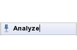
Figure 4.2. Menu Header
When UiBinder parses Menubar.ui.xml it checks whether MenuHeader has a
constructor which has String and ImageResource as parameters and
annotated with @UiConstructor. If there is one, UiBinder uses that and
pass String “Analyze” and ImageResource returned by
FinsResource.pin() method. Then action passes on to MenuHeader
constructor where we create the Image and HTML widgets from
ImageResource and text passed by MenuBar. Then UiBinder parses ui.xml
and creates the UI structure with SimplePanel as root item and adds
image and html widgets provided to UI structure.
MenuItem
MenuItem widget is just a GWT Anchor decorated with an icon and text
warped in a SimplePanel. Add ui and class files to
in.fins.client.widget package.
in.fins.client.widget/MenuItem.ui.xml
<!DOCTYPE ui:UiBinder SYSTEM "http://dl.google.com/gwt/DTD/xhtml.ent">
<ui:UiBinder xmlns:ui="urn:ui:com.google.gwt.uibinder"
  xmlns:g="urn:import:com.google.gwt.user.client.ui">

    <ui:style>
        .anchor:hover {
            cursor: pointer;
            cursor: hand;
            text-decoration: none;
        }
    </ui:style>

    <g:SimplePanel>
        <g:Anchor styleName="{style.anchor}" ui:field="anchor" />
    </g:SimplePanel>

</ui:UiBinder>
in.fins.client.widget/MenuItem.java
package in.fins.client.widget;

import in.fins.client.FinsResources;

import com.google.gwt.core.client.GWT;
import com.google.gwt.resources.client.ImageResource;
import com.google.gwt.safehtml.shared.SafeHtml;
import com.google.gwt.safehtml.shared.SafeHtmlBuilder;
import com.google.gwt.safehtml.shared.SafeHtmlUtils;
import com.google.gwt.uibinder.client.UiBinder;
import com.google.gwt.uibinder.client.UiConstructor;
import com.google.gwt.uibinder.client.UiField;
import com.google.gwt.user.client.ui.AbstractImagePrototype;
import com.google.gwt.user.client.ui.Anchor;
import com.google.gwt.user.client.ui.Composite;
import com.google.gwt.user.client.ui.Widget;

public class MenuItem extends Composite {

    FinsResources images = FinsResources.INSTANCE;

    interface MenuItemBinder extends UiBinder<Widget, MenuItem> {
    }

    private static UiBinder<Widget, MenuItem> binder = GWT
            .create(MenuItemBinder.class);

    @UiField
    Anchor anchor;

    @UiConstructor
    public MenuItem(String text, ImageResource imageResource,
            final String contentName) {
        initWidget(binder.createAndBindUi(this));
        anchor.setHTML(getHtml(imageResource, text));
        anchor.setName(contentName);
    }

    private SafeHtml getHtml(ImageResource image, String text) {
        SafeHtmlBuilder sb = new SafeHtmlBuilder();
        sb.append(getHtml(images.blank()));
        sb.append(getHtml(image));
        sb.append(getHtml(images.blank()));
        sb.appendEscaped(" ").appendEscaped(text);
        return sb.toSafeHtml();
    }

    private SafeHtml getHtml(ImageResource image) {
        return SafeHtmlUtils.fromTrustedString(AbstractImagePrototype.create(
                image).getHTML());
    }
}
MenuItem.ui.xml uses inline style so that it affects MenuItem
anchors only.
Method getHtml() converts text and image to SafeHtml and Anchor
uses it to display the image in the link. SafeHTML makes it safe to
use with respect to potential Cross-Site-Scripting vulnerabilities. To
differentiate anchors on menu selection, method Widget.setName() set
the anchor’s name
MenuBar
MenuBar composes MenuHeader and MenuItem into menu. Add
MenuBar.ui.xml and MenuBar.java
in.fins.client.widget/MenuBar.ui.xml
<!DOCTYPE ui:UiBinder SYSTEM "http://dl.google.com/gwt/DTD/xhtml.ent">
<ui:UiBinder xmlns:ui="urn:ui:com.google.gwt.uibinder"
  xmlns:g="urn:import:com.google.gwt.user.client.ui" xmlns:f="urn:import:in.fins.client.widget">

    <ui:with type="in.fins.client.FinsResources" field="resource" />

    <g:StackLayoutPanel unit="EM">
        <g:stack>
            <g:customHeader size='1.8'>
                <f:MenuHeader text="Analyze"
                                              imageResource="{resource.pin}" />
            </g:customHeader>
            <g:LayoutPanel>
                <g:layer left='0.5em' width='10em' top='0.5em'
                                         height='3em'>
                    <f:MenuItem contentName="Snapshot" text="Symbol"
                      imageResource="{resource.dollar}" />
                </g:layer>
                <!-- top increment by 1.8 -->
                <g:layer left='0.5em' width='10em' top='2.3em'
                                         height='3em'>
                    <f:MenuItem contentName="Watchlist"
                                                text="Watchlists"
                      imageResource="{resource.shoppingBag}" />
                </g:layer>
            </g:LayoutPanel>
        </g:stack>
        <g:stack>
            <g:customHeader size='1.8'>
                <f:MenuHeader text="Manage"
                                              imageResource="{resource.spanner}" />
            </g:customHeader>
            <g:LayoutPanel>
                <g:layer left='0.5em' width='10em' top='0.5em'
                                         height='3em'>
                    <f:MenuItem contentName="ManageWatchlist"
                                                text="Watchlist"
                      imageResource="{resource.dollar}" />
                </g:layer>
            </g:LayoutPanel>
        </g:stack>
    </g:StackLayoutPanel>

</ui:UiBinder>
in.fins.client.widget/MenuBar.java
package in.fins.client.widget;

import com.google.gwt.core.client.GWT;
import com.google.gwt.uibinder.client.UiBinder;
import com.google.gwt.user.client.ui.ResizeComposite;
import com.google.gwt.user.client.ui.Widget;

public class MenuBar extends ResizeComposite {

    interface MenuBarBinder extends UiBinder<Widget, MenuBar> {
    }

    private static UiBinder<Widget, MenuBar> binder = GWT
            .create(MenuBarBinder.class);

    public MenuBar() {
        initWidget(binder.createAndBindUi(this));
    }
}
In ui.xml, StackLayoutPanel is the root widget and each stack adds MenuHeader and LayoutPanel. Template adds the MenuHeader with
appropriate image and text using customHeader and adds required MenuItem to each LayoutPanel with appropriate image, text and name.
Modify FinsShell.ui.xml to add MenuBar.
in.fins.client.content/FinsShell.ui.xml
....

<g:SplitLayoutPanel ui:field="split">
  <g:west size="150">
    <f:MenuBar ui:field="menuBar" />
  </g:west>
  <g:center>
   <f:ContentPanel ui:field="contentPanel" />
  </g:center>
</g:SplitLayoutPanel>

....
Now Fins is ready with a stacked Menu bar. To make it functional, we
have to wire MenuItem and ContentPanel to add content tab when user
clicks MenuItem and the next section cover multiple options to deal with
events.